A new logo and tagline unveiled for the capital of the Costa del Sol: 'Malaga, the all-round city'
The new design was created by the Brida-Lizarraga Palau company and chosen from 22 entries
Matías Stuber
Malaga
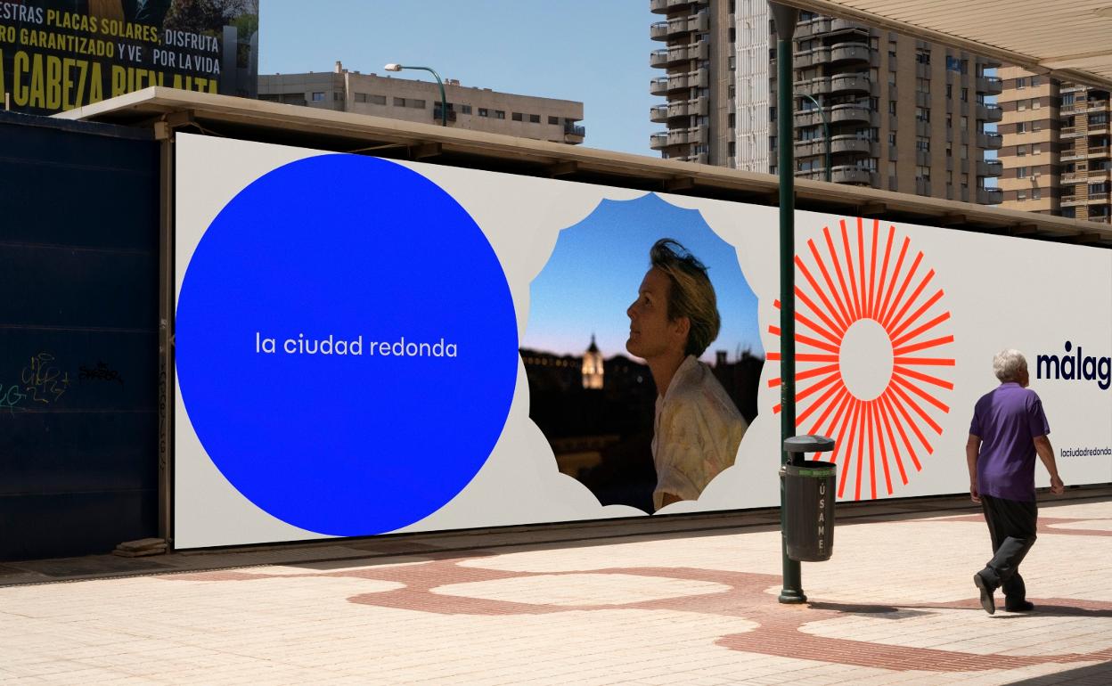
Every city has its own logo or brand, and on Monday Malaga said goodbye to its old one, ‘Malaga, ciudad genial’, and introduced the new ‘Malaga, ciudad redonda’, which was chosen as a reminder that the city, while a popular tourist destination, is now much more than that, as it is also an economic hub of southern Spain and a city of culture.
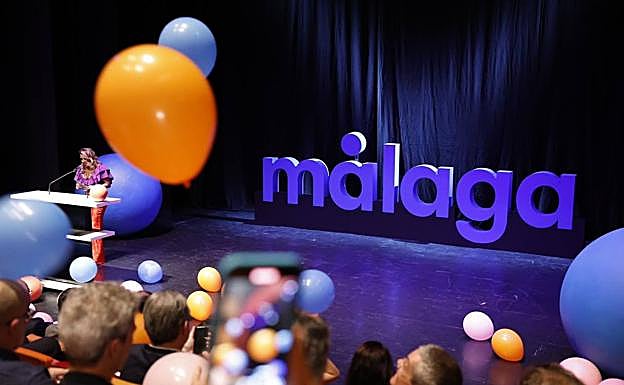
The new logo was revealed at an event at the Echegaray Theatre, which was packed by officials and individuals keen to see the new design.
This was the culmination of a project which began two years ago, when the council invited companies to submit their designs, and it received 22 proposals. Five finalists were then selected, and the winner was a joint venture company formed by Brida and Lizarraga Palau.
Their design has the name Malaga in blue lower case letters and the accent over the ‘a’ is in the shape of a small circle. Eduardo Cholvis of Brida and Javier Torres of Lizarraga-Palau explained that the aim had been to represent Malaga as an open and cosmopolitan city which provides a high quality of life for those who live and work there. A type of paradise, in fact, which wants to attract the whole world. “It is an all round city in all respects,” said Torres
The mayor of Malaga, Francisco de la Torre, said he identified very much with the idea of it being a complete city in all senses, and that is what is meant by ‘ciudad redonda’.
The winning entry was chosen by a panel of seven professionals from the field of publicity and communication.